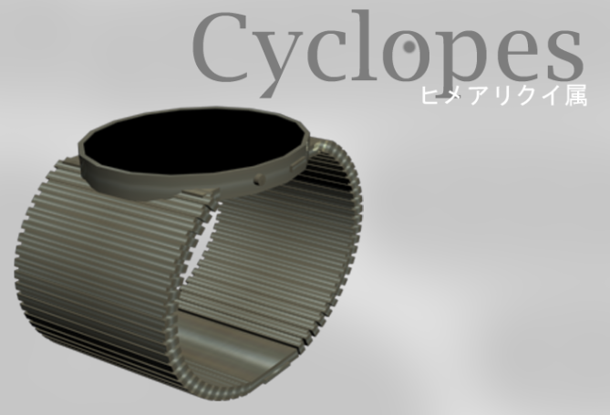
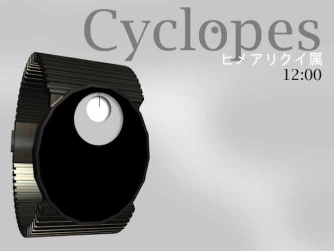
Design submitted by Jordan from Canada.
Jordan says: “The simplest eye, such as one found in micro-organisms, does nothing but detect whether the surroundings are light or dark. This eye, however, doesn’t even do that. I wanted an eye-like watch face that was both minimalistic, and visually appealing.
There are two variations of this watch design; an always on version and a button activated version. The time is read like an analog watch. The ‘pupil’ (in white) circles inside of the light gray oval. The gray oval circles inside of the face of the watch. Both the pupil and the other oval have a small black line pointing to either the minute, or hour. The pupil points to the minute, and the other points to the hour.
The manner in which the ‘pupil’ is designed gives the face the illusion of depth; it’s like you’re looking in to the watch rather than at it. The face and band are made of brushed aluminium, like the Kisai Denshoku watch, and so, the watch is very light-weight.”


Cool idea for a minimalistic analog watch. I support it, cause I have a similar (but distinguishable) idea 🙂 Good watch name, sufficient images which transport the idea. The final appearance could be less edgy though 😉
LikeLike
Your renders are getting better, Jord. The idea is really cool, having the time telling offset from the center of the watch face is pretty cool. The inset layered effect also looks interesting.
LikeLike
Thanks kindly 🙂
LikeLike
It looks like weight measurement device, but its watch design. Cyclopes the name given. Ok, well regardless of its name, but yeah I think its okay, how about putting this watch in eleno range with slightly modification for example the area that shows time put on the left or right sight, and the branding on empty space? I think its a good design. I obviously give 5* for every design I comment. Good job!
LikeLike
Really like the design overall, but not overly keen on the strap. The name is good and along the theme of eyes, thought it might be cool to try it with a different colour cornea ? (grey circle), e.g. blue/green/brown, then white outer circle and then black inner circle with white line?
LikeLike
The details aren’t final. Color, strap size, etc. can be played around with. Nice sounding color schemes though.
LikeLike
I love you’re designs. they’re amazing. hope tokyoflash, if not somebody else, makes it real
LikeLike
It’s people like you that make this blog a truly enjoyable place to be.
Thanks for your support, and your comment 🙂
LikeLike
5 stars from me – it’s the concept that gets the vote… yes, the strap is a bit chunky, and I’d prefer a round face, but those are mere details on what is a great idea. With a bit of refinement this would make a great watch
LikeLike
Cool watch design, I also think the strap/face isn’t to good.
I think it would be even better if the minutes floated in the hour circle
LikeLike
Cool. Easy to read for the insider and difficult to read for outsiders. I would buy it.
LikeLike
Cool! Simplify! Dashingly!
LikeLike
(Late to party, I know…)
Love the concept, uncertain on the feasibility of execution ONLY because it looks like the aperture for the minutes and hours seems to look like it’s rotating between the two demonstrated time positions. However, I do love the design/concept (again – I’m a sucker for analog watches that are always on); also will second the thought about color scheme to make it more akin to an eye – black pupil, colored iris, white sclera – but I like the visual impact of this color scheme as well.
Well done!
(And shoot, now I have an idea for a watch…)
LikeLike