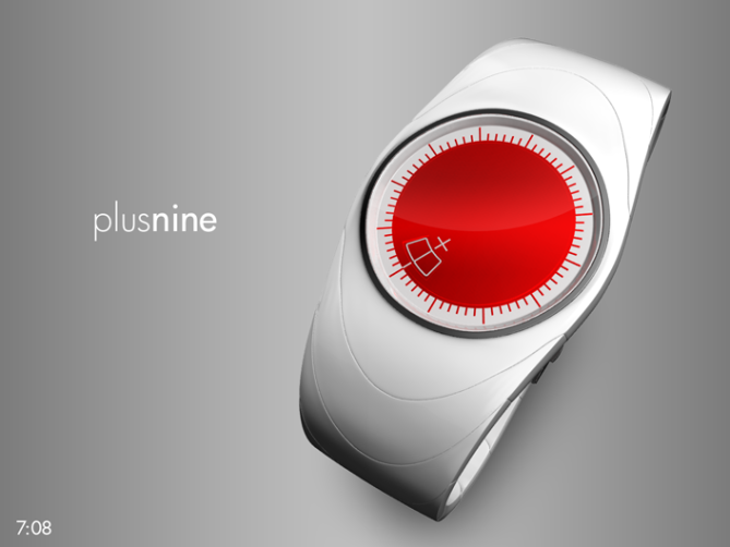
Design submitted by Sam from Germany.
Sam says: “Two ideas inspired me to come up with this watch design. The first came from thinking about Japan a lot these days. I have seen people wearing the white space with the red dot (the Japanese flag) in many variations. Be it a sticker or a button or a cap. I wanted to design a wrist watch that reminds me, that there is always a future for Japan. Other people have their own thoughts about it… My second idea was to make a simple and unusual analog watch design.
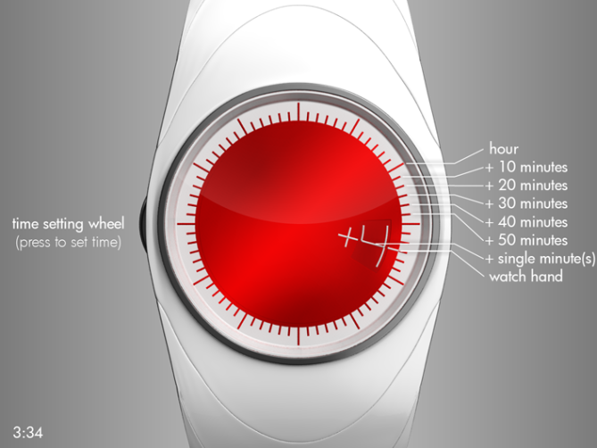
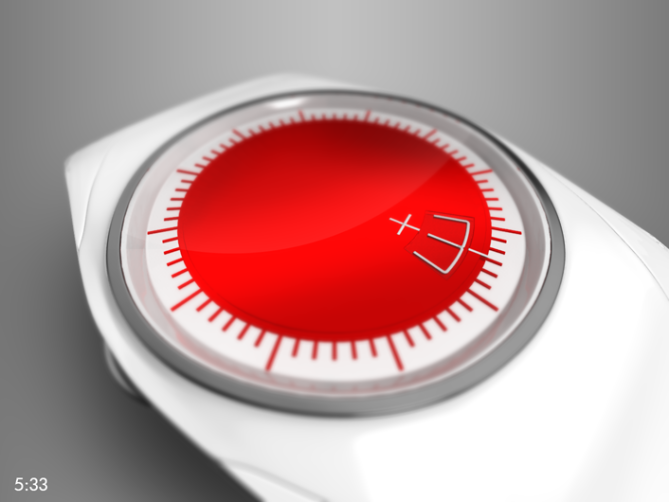
The big red sun was there in the first sketches of the watch. I added a scale which is reminiscent of the suns rays. It looks like the scale on a traditional analog watch, but I divided the space between two hours by 6 (instead of the traditional 5), so these little intervals represent 1/6 of an hour (10 minute steps) and can be shown by the hour hand already. The additional minutes are shown by a number that follows the watch hand. These digital numbers are controlled by another analog mechanism which interacts with the movement of the watch hand. I named the watch “plusnine” because you have to add up to nine minutes. There are no further numbers, except the additional ones, because the hours positions should be clear.
I think, men and women, who like to wear a bit of Japan with them and who also like to show it, could like this watch design. Besides the current events, which make us think about Japan, there are many Japan fans out there who might wanna have a wrist watch like this.
This analog watch design represents a country and everything, the wearer feels about it.”


Clever, stylish, masterful… Samful.
Congrats!
LikeLike
Thanks Laszlo 😀 Samful is a good adjective.
LikeLike
Hello Sam, the watch is very beautiful, I love modern. For the symbol of Japan, it must be said, because the red circle is too large compared to the watch, even if the watch is beautiful like that (the red sun of Japan on a flag has a proportion, if you leave remote, it does more).
Today I am a little “critical”. Make an analog watch and complicated to complicate the reading, I have a doubt?
I type “yes” because the design is very beautiful!
LikeLike
Thank you Patrick!
@ All: Be critical and have doubts, it is good for the blog actually.
I used the flag as inspiration. That means, it gives me a rough direction. I saw many different interpretations of the flag, they all have white ground and red dot in common. Proportions and materials vary very much. I didn’t try to make a 1:1 copy so many things differ from the original 🙂 I think the reading isn’t that much complicated. It just has one hand and a number. Some people already have problems with analog watches, because they grew up with digital diplays. Some people can read numberless analog watches very quick. This watch is a middle way.
LikeLike
OK Sam, at first, I’m not sure we think the Japanese flag, it’s no big deal, because the watch is very beautiful.
For his reading, it is personal and I did not necessarily right?
But it’s a great job as always!
LikeLike
🙂 Thanks for you view Patrick, really.
LikeLike
I tend to agree, the Case and Strap along with the red center piece and dark ring says more Portal turret than Japanese flag.
Though the design IS beautiful and quite stylish. I would wear Portal watch! 😀
LikeLike
Hehe, it’s good if you have other parallels. The ring is an adornment to frame the display (especially the sun rays) and I made it chrome, trying to let it be neutral. I think in white it could look ok too…. Check out these alternatives Cory. Thank you for your input 🙂
LikeLike
Hello Mr Jerichow, what a beautiful design. Clever way to tell the time. Good development of analogue watch. The watch looks simple yet appealing. I feel like to wear it right now. Can I buy one 😉
LikeLike
Hehehe thank you Firdaus t.h. Yeah I re-interpreted the analog watch in a samful way (that adjective is so practical!).
LikeLike
Samful ©
LikeLike
Du machst 2 Designs und ich schaff ned mal einen *seufz*
Anyway. It looks great 😀
LikeLike
Wenn du einen Tip brauchst, sag bescheid, ich habe ne Wiele mit SketchUp gearbeitet. Ansonsten mach ganz ruhig. Der Blog läuft nicht weg. 🙂
Thank you!
LikeLike
Sam! I’ve been so busy with work that I haven’t had the time to leave any comments on the designs here for months. That said, when I saw this design today, I had to take a quick minute to let you know that you hit the bullseye with this one! The style of the watch is simple and clean while the display is unique, intuitive, and engaging; I can honestly say that this is easily my new favourite analog design.
Since I always like to contribute something with my comments, I would suggest that this design would lend itself quite well to additional colour and font combinations. I know you were going for a Japanese flag motif with this design (and I think the result looks great), but I would love to see what other variants you could come up with to expand the line.
Keep up the great work!
LikeLike
King, you take the thoughts off my brain: Yes color variants are a good idea. I wasn’t sure how to come up with them. Your comment is a welcome impulse! I could change the white and the red into anything… Then its a smooth watch with a big dot in it and a little number – still an eye catcher and everyone can pick his/her own favorite. About another font, I liked to have this one because it arranges so well with the + and the – and the circle…
Hey, it’s cool you came by today. If you can manage, stay tuned for more analog designs in the future 🙂
Thanks for your input! And yes I will 😉
LikeLike
If you’re looking for colour suggestions, I have a well-established reputation for appreciating watches that are both black and green 😉
LikeLike
I prepared an automated production of 100 variations (10×10; red, orange, yellow, green, cyan, blue, purple, magenta, white and black for the watch&number and the big dot&rays). I will show them in an array, but will pick out the good ones separately because… green and purple is eye-boiling, hehehe.
LikeLike
Automated colour combination? Sam, as a computer scientist, I like the way you think 🙂
LikeLike
Well semi-automatied. I chose the colors and the way they get combined, then hit a “do it” button and waited 🙂 The array production was also semi-automated. I’m less a scientist, more trial-and-errorist (begins with t, ends on -errorist, call the CIA!). Anyway, I made the overview here. As I announced, it’s 10×10 variations. 75% can be kicked in the trash 😉 I like the ones which have black or white in them. Those with near-by colors are ok for me. The high-contrast variants aren’t my taste, but some jittery (if not squirrely) people might like them. Changing colors is one of the easier tasks in watch manufacturing, so people can be satisfied I think.
LikeLike
Yeah, I think the ones with the white and black strap/case are my favourites (looking at them, I think the black strap/case + red face is the one I would most like to buy, with the black + green coming in a surprising second) but, given the recent re-popularization of 80’s-style vinyl watches, I could actually see a market for some of the brighter ones.
Also, be careful with all that try-and-errorism or the CIA might send a Navy SEAL team after you 0_o!
LikeLike
Yes, Yes, YES. Make it, make it, MAKE IT!!
If this was for sale, I would be hitting BUY right now. Gorgeous
LikeLike
Thank you Bruce! I like your enthusiasm. That’s pretty encouraging 😀
LikeLike
Awesome. Simple and complex in the same time. Very good Sam, congrats:)
LikeLike
Thank you Gabriel 😀
LikeLike
very cool, original, compact, minimal, stylish, japanese watch. I’m not sure if the “+” is essential, but maybe tastes are more minimal than most. I think it ticks all the right boxes so should have a good chance of becoming reality, good luck! 🙂
LikeLike
Thank you Keiron! I didn’t think much about the + since I made up my mind pretty early. It’s not essential but it comes with the watch name 😉
LikeLike
Nice and sleek and minimalistic…just my type
Try going with different colors? ahah
LikeLike
Thank you Bok 🙂 Look at this for some color variations.
LikeLike
Beautiful as always, Samukun! I personally am a huge fan of your designs, and a lil’ bird whispered in my ear, telling me that a watch of yours was made into production. That was a long time ago, and i still haven’t seen’em in the shop! It’s kind of a let-down every time I visit Tokyoflash website and none of your designs available. Sam, I am still waiting for the touch-sensitive, color-changing watch with a die!
LikeLike
Argh that little bird was a little overhasty. I still have no definite information about a production (or consideration) of one of my watches :I But it’s always wise to stay tuned.
GEEK, check out my Canvas concept.
Well it’s not touch sensitive (but it could be if it turns out to be more practical) and changes (theme and light color) as you wish. My light circle concept was pure light and colors. No more commenting possible though :I But I have other adaptable concepts in my sketch book. But tell me, what is a die? My dictionary offers me like 40 more ore less similar translations 😉 It could be something, one of my coming concepts has…
GEEK, thank you alot!
LikeLike
I was actually talking about this one:
http://www.tokyoflash.com/blog/2010/11/touch-screen-cube-led-watch/
But the canvas consept is also very interesting. I just think it will be a bit hard for people like myself to programme it… Maybe to have different themes built onto the onboard memory, just to get something to choose from 😉
LikeLike
Oh yeah my touch your time watch. Now I get what a die is. Oh man such a word xD
GEEK, you have fonts on your computer and some pictures. Thats all you need. And taste, you need taste to arrange the time and the background. So no programming skills needed. But for the case, it is still too complicated, I suggest, everyone shares his/her themes online so you can choose what you like. And you can still change it whenever you like. Already onboard themes would be pretty wise to advertise the watch and to satisfy the people.
LikeLike