Design submitted by Peter from UK.
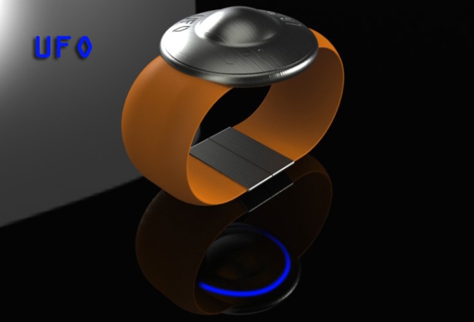
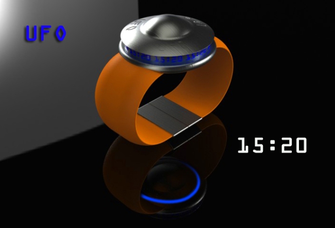
This watch design is a combination of Sci-Fi and retro design. The classic flying saucer shape seemed to lend itself to a watch.
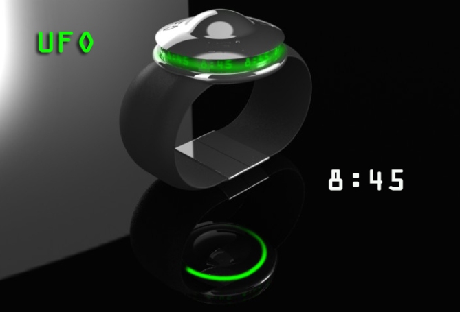
To tell the time you simply push down on the centre of the saucer which operates a push latch which raises the centre section revealing a wrap around the display. Time revolves around in a glowing b-movie style.
The underside of the saucer also has a glowing ring to add to the effect. To turn off, simply push the centre again to close the saucer.


I would LOVE to buy one of these, but PLEASE lose the UFO lettering. It is much better without that. Great watch!
LikeLike
If you wish to see newer/better images of this concept please drop by my fb page (PF Design) click on my yellow name and look at the photo albums.
Thanks for the Feedback Bobby! 🙂
LikeLike
i agree!
i like the overall concept. the whole push down to have it pop up thing.
however i think that actually having “ufo” on it, just makes it look kinda cheesy.
LikeLike
I think Sam’s suggestion of the Kisai logo would be a nice alternative, but I would have not issues with having no logo at all. Im glad you like the overall concept.
Thanks for the feedback diclonius! 🙂
LikeLike
Nice concept … seems like driver watch … one can see while driving a car, bike when your hand is in tilted position …
If possible represent time at the surface around the dome where you have write UFO … Nice signature watch …
LikeLike
Thanks Ranjan, something to think about, cheers for the feedback! 🙂
LikeLike
Aaah, it is a watch which I know already, of my friend Pete, I like also a lot because I like science fiction for years 50-60, among others …
So it’s always a 5 * and a Yes!
LikeLike
hehe, Patrick is also biased as he has also done cool UFO style watches in the past!
Thanks for the comment and the vote Patrick! 🙂
LikeLike
Mars Attacks!
I suggested this for Patrick’s concept back then too: It’s an UTTO, an unidentified time telling object 😉
+ the opening mechanism! GMTA Pete 🙂 I hope TF shows my Revelation watch not too soon, hehe. I love it!
+ the time revolving, perfect within the theme and definitely cool
+ the landing light, imagine this! This must look like an arm invasion when you wanna check the time!
+- It’s a bit chunky, but that’s the logical consequence of the theme.
– I think this time a Kisai logo would’ve been better than the UFO letters. Minor thing, don’t worry 🙂
I’ve seen your alternative materials on your page and I like the metal bracelet one. That bracelet and the time revelation are making me really really want the watch.
LikeLike
Cheers Sam, Yeah the Kisai logo would have looked cool, wish I’d have thought of that! :p
Could be a little slimmer if needed, but I went for the classic shape.
Thanks for the critique (in vain as it follows your epic cypher!) lol
Thanks a lot Sam 🙂
LikeLike
Thanks TF for adding this concept to your blog (shame is after the epic cypher! tough act top follow) If anyone would like to see newer/better images of this watch check out my fb page (PF Design) click on my yellow name.
LikeLike
Wow, this is awesome! Should appeal to the sci-fi fans like me!
The newer images on your face book page are vastly improved!
Based on those 5* and Yes sir!
LikeLike
I’m glad you like it, hopefully others will too.
Yeah the newer images were in response to feedback from my page, they do look a bit more impressive.
Hopefully people will check them out before voting as it may improve their view!
Thanks for the comment and the vote 🙂
LikeLike
I like this a lot! it looks a bit big for a Ladies wrist but would make a great present for chap!
5 stars and yes!
LikeLike
Yeah its probably better suited to a larger wrist in its current format, but could be easily shrunken down for a Ladies version.
Thanks for the feedback! 🙂
LikeLike
I really like this, its retro futuristic chic! Im loving the metal bracelet version on your page! needs to be made!
Would buy this no hesitation if it were made, 5/yes
LikeLike
Thanks for checking out the newer images on my page, yeah the metal bracelet works well, looks more war of the worldy!
Thanks for the comments Cole! 🙂
LikeLike
Interesting design you got here. I vote for outside the box idea. We from secret organization for UFO hunt will surely buy these for each members!
LikeLike
hahaha, MIB (Men In Braces) Ideal promotional product for Trekie conventions! Can I put you down for 100?
Thanks for the outside the box comment! 🙂
LikeLike
The men in black would be your first buyers of this awesome watch.
Your newer renderings of the design look great! Me Gusta.
LikeLike
Oh, and brushed metal version plz 😀
LikeLike
Thanks dude, I just hope other folks also check out the newer images before they vote.
If they make it I’ll give you a brushed metal one! hehe
Thanks for the vote! 🙂
LikeLike
Wow this is really fun! I like this.
LikeLike
I’m glad you like it, check out the newer images on my fb page by clicking on my yellow name.
Thanks for the comment! 🙂
LikeLike
Cool shape, and i love the way it opens and is visible from the side. Very original and unique concept as always Pete 🙂
LikeLike
Hey Keiron, Happy Birthday btw. Have you seen the newer images on my page? they do it more justice.
I’m glad you likey! Thanks for the comment! 😀
LikeLike
According to the computer this entry RIPs tonight (not entirely convinced)
but as this one has gone pretty quite I will summarise.
This entry had a fairly modest amount of interest and has aquired a modest score.
It hasn’t seen much action on the external blogs either sadly.
Thanks to everyone who did vote and comment and as usually we will just have to hope TF see’s some potential.
Regards
Pete from the UK 🙂
LikeLike
Assuming the worst case and nothing happens anymore… you showed us a fantastic ufo watch – thanks for the eye pleasure! IF ufo watch, then like THIS.
Good luck Peter and
BOOOWEEEWOOO
LikeLike
Thanks a lot Sam! 🙂
LikeLike
It seems this one RIPs tonight.
Thanks everyone (again) hehe
LikeLike