Design submitted by Peter from the UK.
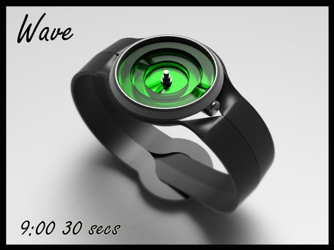
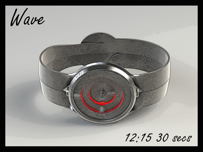
Peter says: I wanted to design an elegant analogue watch using ribbons as a theme. The hands are in the shape of discs which have a ripple in them for highlighting the time and the strap is made of one continuous strip of material.
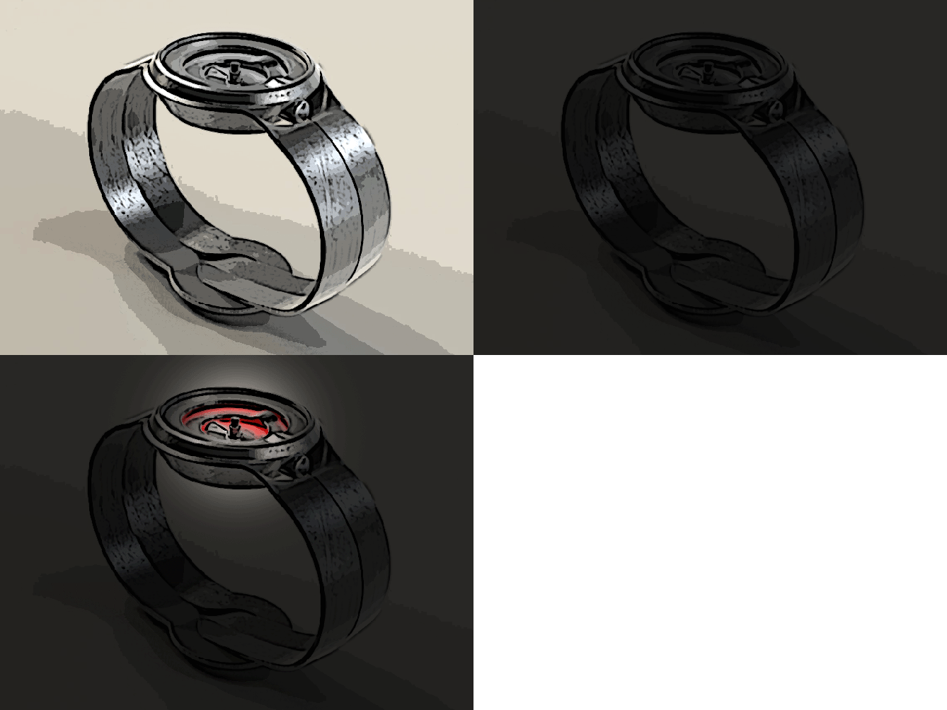
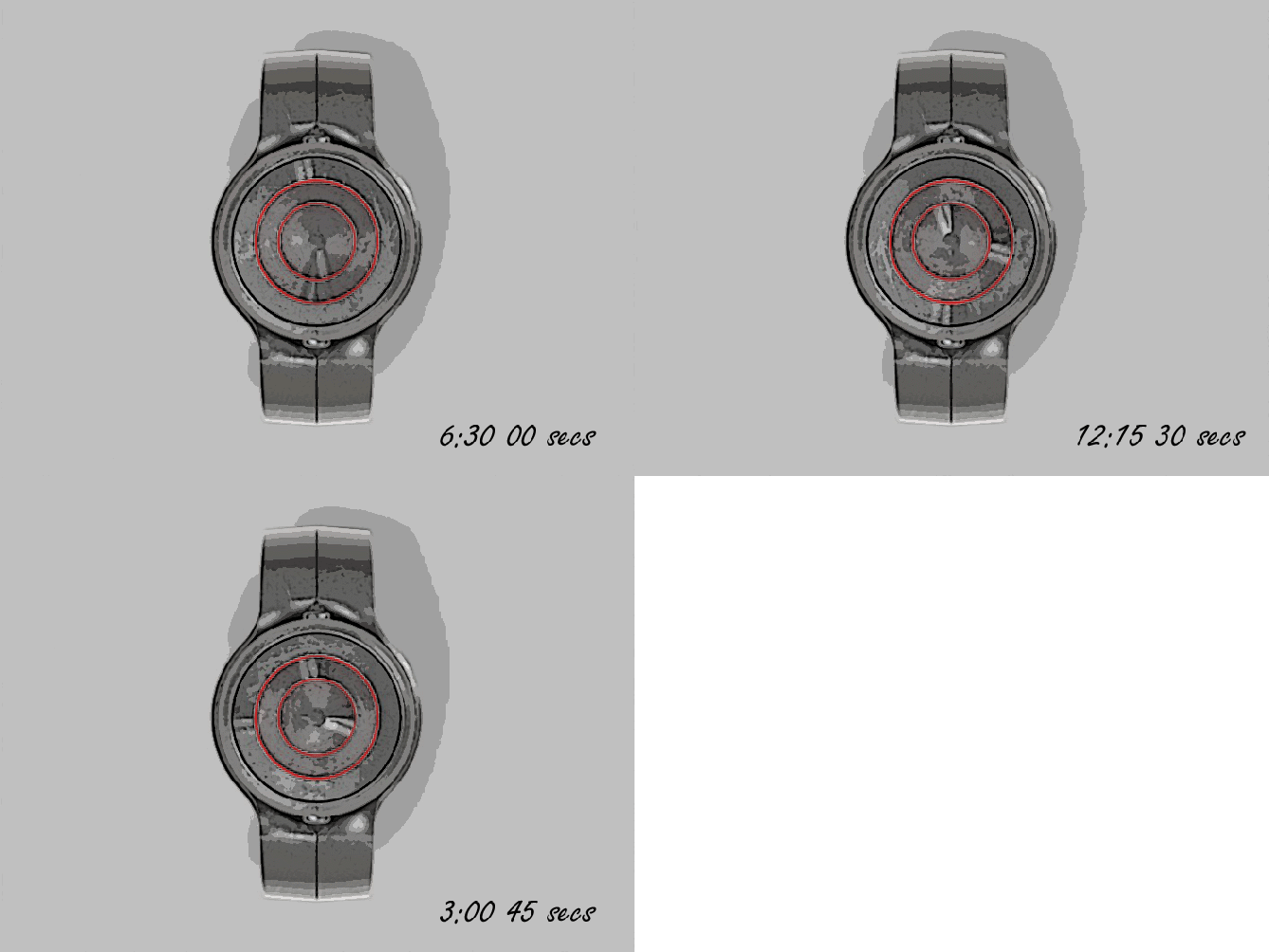
The time telling is the same as a traditional analogue watch, the ripples in the discs act like hands and point out the time. The rings are backlit to aid telling the time in poor light or just to add a little drama.
This watch design stands out due to its elegant look and sophisticated appeal and would appeal to people who like such. It is different enough for the Tokyoflash customer and elegant enough for the more traditionalist.


Wow! Very sleek and elegant. I love the design and I’d say hurry up and take my money if I had any.
LikeLike
Thank you Anthony (we accept cheques! hehe) Thanks for the great comment! 😀
LikeLike
This watch has a great look!
Is there a window on top, since plastic discs that rotate without protection?
5 * / Yes to Pete.
LikeLike
Yeah there would be a traditional case glass, its visible on the exploded image. Hopefully the discs could be aluminium (on the mattallic finish watches) cost allowing. The transparent green ones would have to be plastic I guess. Thanks for the vote and the comment! 😀
LikeLike
Thanks for adding this design to the blog TF! 😀
LikeLike
Hehe we talked about the fliff-fluff effect (not sure about term) 😉
I really like the geometry and the wave in the rings! Very cool how the straps split up to accommodate the case. I think with the knowledge that Tokyoflash gained with the Uzumaki, a new wave of analog watches could come. Good luck and 5*/YES
LikeLike
Fliff-fluff? lol
Im glad you like the style and the split in the strap. Fingers crossed TF choose to do some more analogues soon! x^^x Thanks for the comment and the vote Sam
LikeLike
Nice design Pete. 😉 I think I like the black and green one best. 5Y
LikeLike
Thanks a lot Mushy, I did a couple more colour varients than show here.
Check out the album on my fb page, cheers for the vote and the comment! 😀
LikeLike
Great! Now I like the black and purple one as well. 🙂
LikeLike
Im sure when “Cryptolite” comes out you you will be able to afford both! 😉
LikeLike
For anyone who’s interested there are more images of this design on my fb page (PF design) click on my yellow name or the link below:
http://www.facebook.com/#!/photo.php?fbid=271160332965701&set=a.270990296316038.63731.159423137472755&type=3&theater
LikeLike
http://www.facebook.com/media/set/?set=a.270990296316038.63731.159423137472755&type=3#!/photo.php?fbid=271160332965701&set=a.270990296316038.63731.159423137472755&type=3&theater
LikeLike
pretty dam smart idea peter!
LikeLike
Thanks Brent, Im glad you like it! Cheers for the comment! 😀
LikeLike
hey, pete! i really like the first image a lot, and if i could read analog without indicators, i would buy it…i especially like the black one with the purple light on your fb page!
i like the way you made the straps fit around the case, and also i’m a fan of the fact that it includes seconds – constant movement is a big plus for me! 5* great idea!
LikeLike
Hi Heather, Yeah the first image is a new one which I did the other day with the black and purple one you like.
Hopefully people will check out the other images on my fb page before they vote as they may help.
It would be no trouble to add indicators to make the time reading easier.
Yeah the seconds hand would add a little animation, like a moving sculpture I guess.
Im glad you like it and thanks for the vote (it needs the stars) and the feedback! 😀
LikeLike
Awesome design! I would buy this so fast! I am think about taking apart a watching and replacing the hands with discs….. I think I will try and make this!
LikeLike
Hey Ben thanks for saying. Making your own disc watch is a cool project (just dont do it to an expensive watch just in case! lol) The discs would need to be made of very light material. If you were trying to imitate the first image you could achieve a similar look with some small vac-forms in a thin plastic. Feel free to post any photos here or on my fb page (PF Design) I would love to see them.
Thanks for the comment and the vote! 😀
LikeLike
Im 100% against the strap design.. I think its too cheesy but the watch idea as really good. 5 and yes depends on the strap.
LikeLike
Crikey the full 100% thats pretty against! lol
I thank you for your honesty and the 5 depending on the strap detail. We will just have to see what happens! 😀
Cheers for the feedback and the dependent vote! 😀
LikeLike
http://techcracks.com/2012/06/wave-analogue-watch-concept-peter-fletcher/
LikeLike
That’s a nice design. I love the “Hot and cold transparent discs” picture ( on fb ). I like the wristband and some indicator would be nice.
LikeLike
Hi Makkovik, cheers for taking the time to check out the fb album too. I like the coloured transparent the most too. The newer images including the hot and cold one has indicators on the case for easier time reading, the extra detail also makes it look more interesting. Thanks for the great feedback and the vote! 😀
LikeLike
There is one improvement that could be made with the wristband : the section under both button could be full, up to the case, so it would be more solid. ( see picture #2 )
LikeLike
Hi Makkovik, Yeah the split in the strap colud be closer to the case (less of a hole) I imagine this would depend on the material the strap would be made of and how formable it is (if it were made of course lol)
I wanted a strap made of one piece so tried to make the split realistic which could have compremised the design a little I guess. Cheers for the feedback! 😀
LikeLike
This one ends soon, so a big thanks to everyone who voted, commented and shared.
Thanks to TF for posting it here!
Cheers everyone,
Pete from blighty
LikeLike