Design submitted by Sam from Gemany.
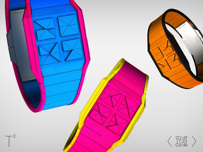
Sam says: t³ stands for tactile triangle time. The t³ is also a hint for the third dimension that this watch concept takes advantage of. I like watches and concepts with a tactile interface and really liked to make my own.
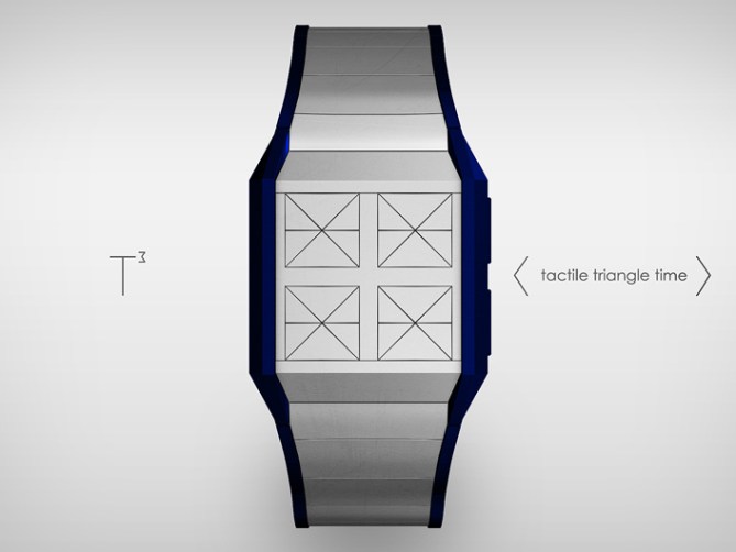
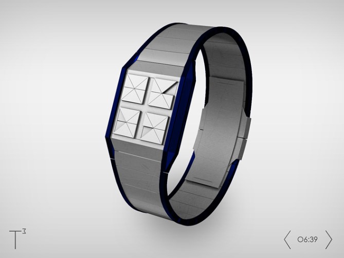
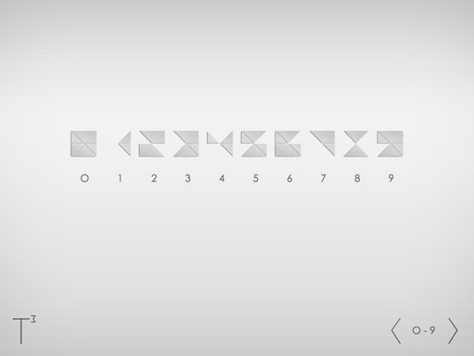
I thought about using electromagnets that manipulate digital numbers. For those numbers I needed to find a balance between the amount of segments and reading comfort. Now there are four numbers with only six triangle segments each. The segments would be risen all the time, held up by springs that are not too strong. At the pressing of a button, electromagnets pull some segments down for some seconds and the ones that remain risen tell the time. The numbers can be seen and touched now.
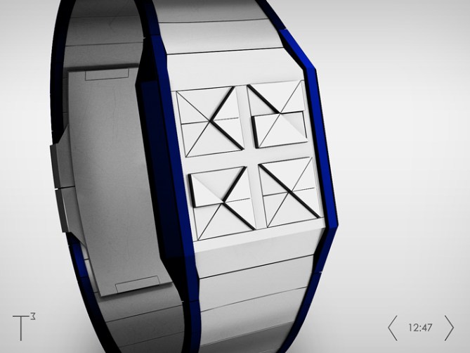
The watch around the numbers is held slim and edgy, following the style of the numbers. The watch could come in many different materials. I prefer anodized aluminium – light and sophisticated. But the display style allows crazy colors too.

A tactile display is fun. You don’t need to look at the watch to tell the time. Visually impaired people might find this watch useful and enjoy the diversion for their fingers as much as seeing people might enjoy the artistic look.


Hi Sam! Great design. Reminds me of adjust. I like this overall look of T3 more than adjust though. Make it multiple colored LED a d would buy before adjust. I also need help. I’m only 11 and have just drawings of designs. I need help on finding a program too use. Wichita one did u use.
LikeLike
Sorry didn’t mean to put LED just multiple colors.
LikeLike
LED are a nice hint though 😉 Thank you for the comment!
I am using 3ds Max. But I can recommend Blender to you because it’s strong and free. Maybe too complicated at first and you need a while to produce something that looks like a watch. Maybe SketchUp suits you better. If you check out the blog front page and search for Heather and Valentin, you can see what SketchUp can do.
But actualy, when you can draw your idea that people can understand, send it to Tokyoflash with a detailed description. If it has potential to become a good watch, Tokyoflash might help you to transport your idea. They did it with a concept of a 14 year old a while ago. It was just a sketch at first and Tokyoflash created some 3D images so the people can better judge the concept. In the end the watch got made, it’s the Kisai Kaidoku.
Good luck AJ.
LikeLike
I really like this idea, if the springs are to delicate perhaps you can tweak it to work with lighting, or back lighting, they could be different colors as well. Either way i really like this idea for a watch.
LikeLike
hi sam. i also see a similarity in the digits with adjust, although i can see that these are in fact different. also, i prefer the shape of this one. very cool idea, and very readable. 🙂 i’m not crazy about the bright colors, but the silver one is awesome! 5*/yes
LikeLike
Nice concept Sam! I really like how to read the time, some parts are raised up, which can make it easier to read than other watches. Also, I love the different color designs. 5* and Yes
LikeLike
TF should raise it to a 6!!!!!!!!!!!★ T3>adjust!
LikeLike
I prefer your origami design than this, but the bevel display is something to be highlighted. Brow + black for me yay!
LikeLike
Wish I could see more watch information on the http://www.tokyoflash.com page but when you go there it says the page is closed.
LikeLike
Aww shame you can’t enter the page. It works for me, I wonder why it doesn’t for you.
LikeLike
It would seem they dont allow Japanese IP addresses to look at/access their main website. I can use a proxy browser to see it but that’s it. I mentioned this on their FB page and they posted that for me to contact their email address…. which I had done 30min prior to that already at that point. As of 12 hours ago from then I’ve still not heard anything back.
Its strange. Why not post the “work-around URL” they said on FB for others in a similar fashion to be able to use?)?
LikeLike
Very cool. I like that it’s not exactly easy to read at first glance but obviously the owner will get used to it. What I’m saying is it gives it the illusion of needing to decipher it when someone else looks. I hope this works the way you want it to. My only concern is the name! T3 haha hopefully it doesn’t come to life and work with Skynet and try to take us all over! Haha just kidding but awesome idea
LikeLike
Looks great Sam, the numbers work really well and the 3D element makes it look really dramatic, fingers crossed it can be done! 5/Y best of luck sir! 😀
LikeLike
It is a very beautiful Watch, technology can carry it out?
5 * / Yes, the triangles are a limitless source of inspiration.
LikeLike
Wow what an amazingly cool concept it may require some LED Back light & it may use a similar triangle shapes use in the LED Adjust watch. But otherwise a great concept & I asked myself why I did not think of that.
LikeLike
It’s simple. It’s easy… It’s marvelous. The numbers are right there and you can easily discover what time it is. I agree with the fact that visually impaired people could use this watch. It will bring a new market for sell. 5*
C’mon, Tokyoflash, what are you waiting for???
LikeLike
If it can be done, it would be great! 5Y
LikeLike
If the triangles lit up, you could tell the time and date at the same time. 🙂 Just a silly thought.
LikeLike
The triangles moving up and down in various patterns at regular intervals would be fun. A nice change from the usual animations.
LikeLike
I dig right triangles too, Sam. Nicely done! I just hope I could resist pushing the numbers, they look like irresistible buttons!
LikeLike
…or maybe pushing buttons you can hear the time, that would be a nice touch.
LikeLike
Clever with only six segments per digits, very stylish as well.
There ought to be a market for fashion- conscious, visually impaired persons.
5*/Y
LikeLike
Wunderbach!!!
Thank you Sam!
I like everything in this watch, its colors, design, and even the texture of its plastic casing!
I hope to see it on the market soon!
LikeLike
Good job with the composition of the numbers.
Very compact and good looking and attractive color cambinación.
Perhaps the use of translucent material would enable night vision by LEDs.
I really like the concept
Good luck Sam
5/Y_ 🙂
LikeLike
I like the idea. I have a sketch for the same idea. ( “using electromagnets that manipulate digital numbers”. Not a sent design ) The digits are nice. More cryptic than my model, but easy to figure out.
If “using electromagnets that manipulate digital numbers” is possible, it would be nice to own one.
LikeLike