Design submitted by Peter from the UK.
Peter says: “This is “Raptor MkII”. People who are familiar with the original “Raptor” design will remember the racing car and spaceship like hints in the form. This version carries on that theme but in a more conventional layout and using a more regular screen/display to show the time.
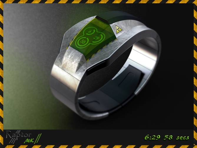
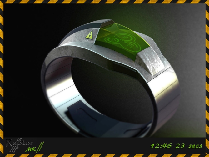
The time telling method is a back to basics digital format, which describes the time in three segmented rings. The hours are displayed by the top ring of 12 segments, the minutes shown by the middle ring of 60 segments and the seconds are displayed by the lowest ring of 60 segments. The digits can also be displayed in the center of the rings in a reveal like mode when speed or accuracy is required.
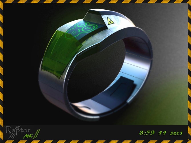
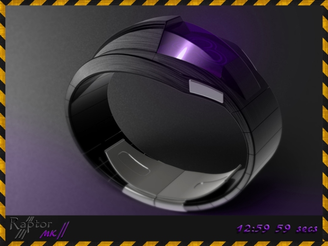
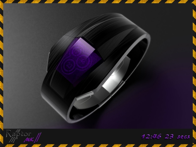
The styling is un-ashamedly industrial and takes cues from F1 cars and fighter jets.
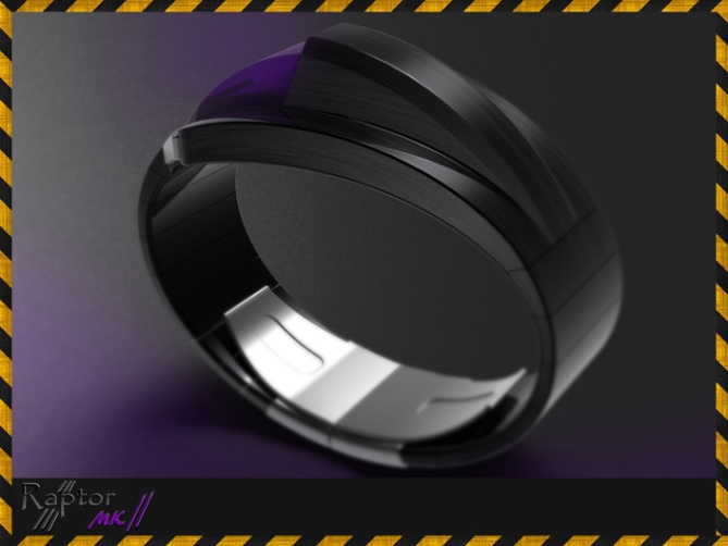
The display is covered by coloured canopy that can be opened for extra clarity. This form factor and detail should help the watch appeal to gadget lovers and sci-fi fans.
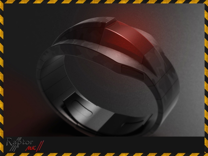
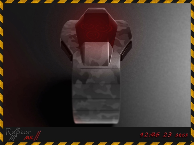
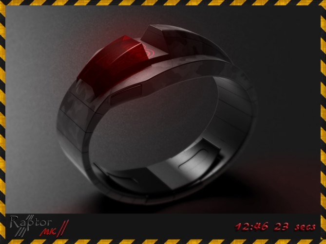
The time telling method is simple and easily recognisable. The form factor and sci-fi theme helps this design and its wearer stand out in the crowd.”


This is hot, really like this one
LikeLike
Thanks a lot Gordon, happy racing! Cheers for the comment sir! 😀
LikeLike
I have love the first model you do, and hope it will be do but this one is prety nice also. Maybe with a different way to read the hour it would be more fun.
Good luck and please continue your job, you really have nice projects
LikeLike
Thanks for the support Tigroo! I’m glad you like the concept. There is always room for improvement, cheers for the feedback! 😀
LikeLike
This is beautiful! 10/10 would buy!
LikeLike
Thank you Shideh for the perfect 10! Cheers 😀
LikeLike
Well Done Pete yet another awesome futuristic concept.
LikeLike
Thanks a lot Andrew! 😀
LikeLike
I like the idea, but this somehow doesn’t quite work for me. I suppose it feels a little too ‘gimmicky’ for my taste, and I’d be worried about breaking the canopy… It’s an interesting display, though, and I’d like to see it as the star of another watch. Good luck with it, judging by the previous comments my opinion isn’t very representative. =)
LikeLike
No worries Anders,
This one is very self-indulgent so I an understand if it doesnt suit everyone.
I guess thats part of the reason I do so many concepts so that I can indulge myself as well as trying to cater for others. Cheers for the feedback and the comment sir! 😀
LikeLike
Yeah, sometimes I indulge myself too as you may have noticed =), I just don’t have the output to hide it, like you have…=)
LikeLike
haha that’s a very polite way of putting it! lol 😉
LikeLike
It looks good, but I prefer the original Raptor – much more interesting (I’d love that if it got made). This version reminds me too much of Kisai Satellite but, with the canopy, not as easy to read.
LikeLike
Cheers for the feedback Nev!, I’m glad you like one of the versions. Yeah it would be cool if TF went down the wild side ever once in a while! 😉
LikeLike
I’d like it with 1/2 or 1/3 of the thickness, so with a more subtle geometry. As for the idea, yeah cool. The time telling looks nice. Maybe instead of a sliding cockpit window a replaceable one would be more useful. But talking about “useful” isn’t the right place actually. Keep the kid alive Peter 😀 And good luck in general sir ^^
LikeLike
I thought the thickness would be an issue for some. Slimmer is often a good thing if the character could be maintained. Yeah the lid is more for fun than for practical reasons. Cheers for the feedback and the luck sir! 😀
LikeLike
Pete, I’m gonna have to start callin you ‘Crazy Pete’! I do think this is less ‘crazy’ than the original and might consider wearing it. I would suggest that you try having the display on what would be the seat back in the cockpit, instead of the seat ‘bucket’–I think that would both improve readability and make the raised profile less of a novelty and more of a feature. The ‘back’ of the seat could slope forward more into the ‘bucket’ and add surface area for the display.
LikeLike
I see what you mean Xian, it would be more of a drivers watch and justify the depth/thickness. Cheers for the feedback! I’m not crazy, I’m just eccentric without the wealth! lol 😉
LikeLike
I’ll buy this because of it’s design alone. Brave and Bold. I love your brain.
LikeLike
Very kind sir! I’m glad you are willing to take a chance on these kind of mad designs. My brain loves you back sir! and chocolate! lol cheers for the support sir! 😀
LikeLike
The valve removable like a cockpit of plane, superb!
5*/Yes, Pete cheer!
LikeLike
Thanks a lot Patrick, you too could be top-gun! Cheers for the vote sir! 😀
LikeLike
I like the cockpit appearance & the open/close cockpit option. I like the radioactive/electricity stickers. The time-telling is a little too conventional but the overall look make up for it.
LikeLike
Thanks a lot Makko, yeah the time telling could be more unusual. Maybe room for development 😉
Cheers for the support sir! 😀
LikeLike
Time runs out for this concept later today so I will take the opertunity to thank TF for posting it here, thanks to everyone who voted, commented and shared! Cheers everyone!
Pete from blighty! 😀
LikeLike